
Displayed measurements use base text = 1em. Component CSS uses its local font context.
Proxima Nova
Website usage · settled desktop sizes, text excerpts. Heading tags vary by module.
Your creators
Your data. Your definitions. Your way.
Predict the right creators.
The Sports Team Emerging
Your data. Your workflows. Your teams.
Content Performance
Original Figma text styles · 25 verified
Original bindings, kept separate from website uses. Button line height is Auto in Figma; browser normal is an approximation. Code styles are bound to Proxima Nova. Figma
Connect people, content and insights.
Bring creators, content and insights together to make a measurable impact.
H1–H6 above: observed website uses; original Figma ramp remains separate. Body: Figma reference. Hero/section labels: live SafeIQ, normal tracking, 0.625em gap below. Field labels: live Request a Demo. Website heading sizes vary by module; audit remains open.
Create impact.
Create impact.
−0.12em tracking. Other campaign and legacy heading variants remain in the audit; these are not a replacement global ramp.
#49A9DE
#ED7A24
#051730
#FAF5F2
#FFFFFF
Color roles & source values
Original Figma tokens and observed website values. Preview one group at a time; modes do not change this page.
Website observations include legacy exceptions. Match component use before mapping a global token. Figma source
Labels 0.875em/1.09375em · 500; fields 0.875em/1.00625em · 400, 2.53125em high, 0.7em padding, 0.25em corners. Select 2.7125em. Submit uses Inter 1em/1.25em · 600, 3.25em height. Demo caret aligned to field padding; extra room reserved for the icon. Local specimen; no CRM connection.
Arial label 0.8125em/1.25em · 500; Helvetica field 1em/1.375em · 400, 2.5em height, 0.1875em corners, #F5F8FA surface. Preserved as a separate legacy family.
3em fields · 1em text · 0.5em corners
Website icon library
Original website assets · Navigation, features, interface, social and checklist marks.
No icons match this search.
190 original assets from audited pages. Hover or focus to reveal Copy; click or tap an icon to copy. Distinct color/framed variants retained. Company wordmarks and article artwork are excluded. Preview sizes do not define component dimensions.
Reusable components
One pattern, named variants. Website references and proposed standards are marked separately.
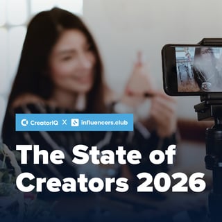
The State of Creators
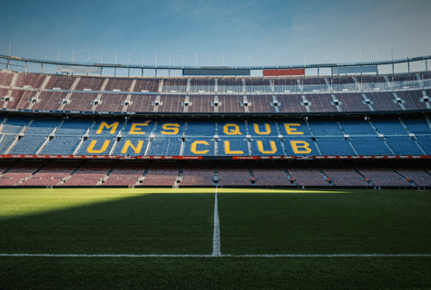
The Sports Team Emerging as One of the World’s Iconic Social Brands ⚽ (HBBIP #154)
Desktop reference sizes: knowledge hub 21.1875em wide · 0.5em corners + 0.0625em border; homepage 30.5625em wide · 0.625em corners, no border. Copy padding 2em / 2em / 3.875em. At narrower widths these specimens adapt; text and padding are not scaled.
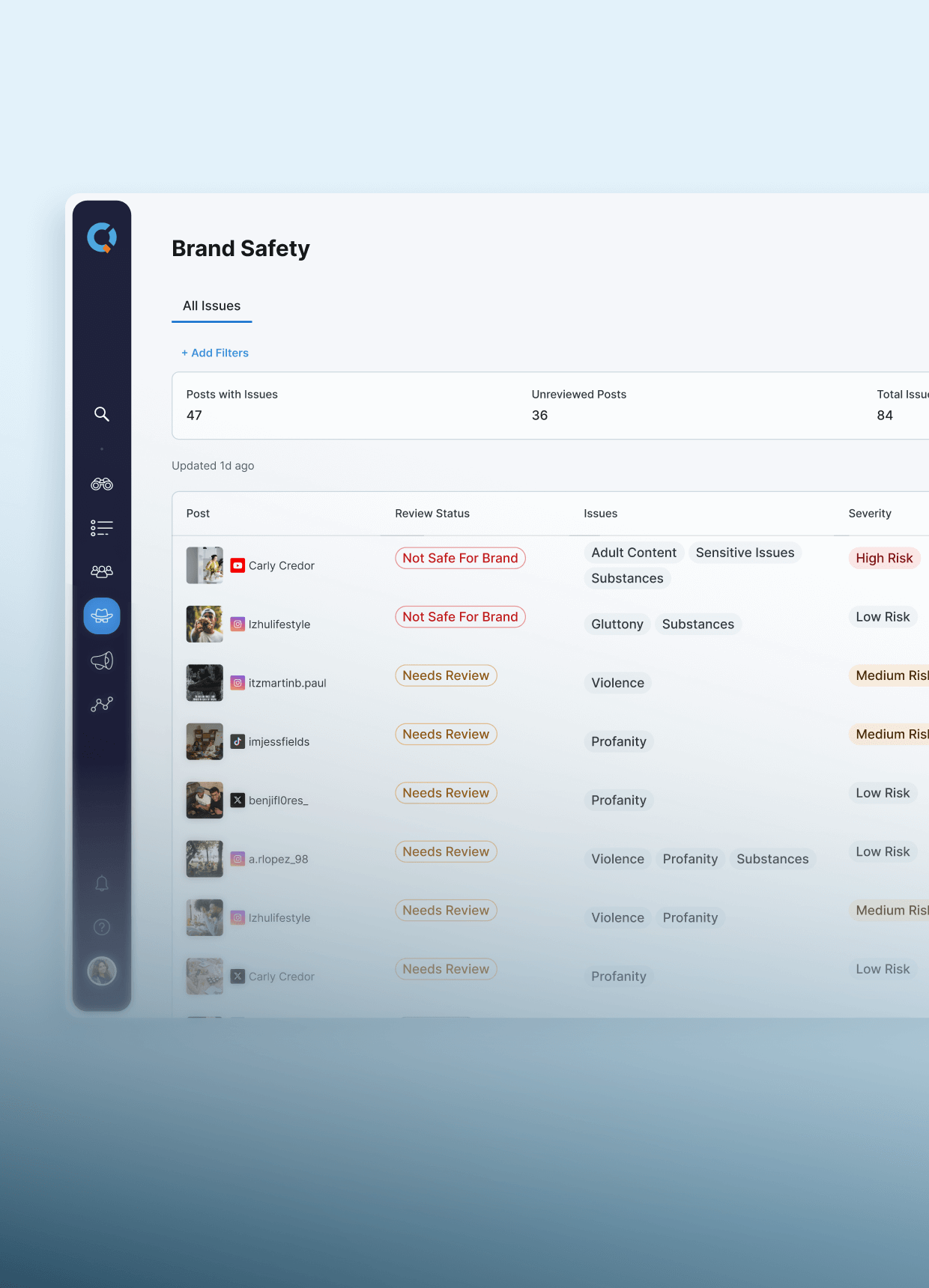
Applied Creator Intelligence
Creator program performance
↑ 18.3% vs. last periodThe compact overlay and metric treatments above are proposals, not full-size website specimens.
FAQ accordion
Proposed unified standardfaq/default · faq/inverseSafeIQ · website · multiple open
What is SafeIQ?
Brand safety and suitability tools for creator programs.
How does SafeIQ detect risks?
Example answer. Source question and row styling retained.
Question1.5em/2.1em·600; answer1em/1.5em·300. Website
Report FAQ · website · multiple open
Why are creator marketing budgets growing?
Example answer. The source uses a rotating plus, not a minus.
Is creator-driven commerce paying off?
Example answer. More than one question can stay open.
Question1.125em/1.74375em·700; answer1.125em/1.85625em·300. Website
Source typography and row geometry; example answers. The unified samples below are proposals with exclusive opening.
How should FAQs work?
Can the same FAQ work on dark sections?
How should FAQs work?
Can the same FAQ work on dark sections?
Question 1.5em/2.125em · 600 (mobile 1.25em/1.75em). Answer 1em/1.5em · 400. 1em row padding · 0.0625em divider · +/−. Native details/summary; each group opens one item. SafeIQ reference. Replace static FAQ grids only after content and module dependencies are checked.
Checklist
Website mark · proposed spacinglist/check Consistent across pagesUse the same orange SVG for benefits and feature lists.
- Wrapped text stays alignedEvery line starts with the copy, never underneath the mark.
-
Same alignment on a dark surfaceOriginal checkmark geometry, shown in brand blue. Wrapped copy stays beside the mark.
1.5×1.6875em source mark + 0.75em gap · 1em between items. Title 1.25em/1.625em · 600; copy 1em/1.5em · 400. Decorative marks use empty alt text. SafeIQ source.
Checkboxes are a separate input: 1.25em control, associated label and visible keyboard focus. Proposed treatment.
Social sharing & follow
Sharing proposed · follow verifiedsocial/share · social/followFollow: original black 2em glyphs on transparent surfaces; 1.75em wrapper + 0.35em side margins and 0.375em link margin. Sharing tiles remain a separate 2.75em proposal. External profiles open in a new tab. Footer source.
Resource controls
Website + proposed treatmentcollection/filter · paginationWebsite multi-select · content type
1.0625em/1.328125em type · 2.953125em field · 0.75em edge inset. Multi-select and checkmarks match the website; keyboard-button semantics proposed. Website
Unified native-select proposal
2 sample results
Page 1 · local specimen
3em pagination controls · 0.375em corners · selected ink / white text. Filters retain context, announce results and offer reset/empty states. Blog reference: current pagination uses a different orange; standardize after approval.
Content & CTA
Website reference · proposed layoutquote/default · cta/inverse · label/category“CreatorIQ helps us identify safe creators so that we know we're making the right decision when we're partnering with them.”Claudia Vine · Moose Toys
Quote 1.25em/1.75em · 400; attribution 0.875em/1.25em · 600. CTA ink surface, 1.5em padding, one primary action. Compact samples based on homepage patterns; same button component, no new button rules.
Examples define the proposed shared patterns. Production modules are not yet connected to these specimens.
Coverage & cleanup decisions
Audited 14 October 2026 · 203 route captures + existing Figma reference. Default captures are complete; states, mobile, delayed forms and Figma reconciliation remain open.
Buttons & colors
Verified / fix candidatePrimary orange, blue alternate, orange outline and white inverse now demonstrated. Main website buttons use Proxima Nova; form submits use Inter. Pagination also introduces #FF8C2E.
Next: one button module with named variants; align form font and pagination tokens after dependency review. White text on orange (~2.9:1) and blue (~2.6:1) needs a contrast decision for normal-sized copy. Preserve brand swatches; approve darker fills or ink labels.
Homepage · BlogFAQs & checklist
Verified / dedupe candidateSafeIQ uses a collapsible FAQ; Discovery uses a static FAQ grid with inline 0.875em answers. The same FAQ content area has different structure and typography.
Next: faq/default + inverse using one shared accordion. Checklist reuses bullet-check-orange.svg with a fixed icon column. Keep schema, copy and existing module usages intact during migration.
SafeIQ · DiscoveryForms & labels
Verified / standard proposedContact fields use 0.875em text, 0.25em corners and roughly 2.5em height. The kit's 3em / 1em / 0.5em field treatment is a proposal, not the current field style.
Next: define text/select/textarea/checkbox/radio, required/help/error/success/disabled states and consent spacing. Keep field names, validation, consent and CRM mapping unchanged until tested in staging.
Contact sourceSocial & icons
Verified / coverage openFooter follow links are present; the sampled blog article has no article-sharing widget. The library now includes 190 original assets from audited pages, including feature, interface and framed variants.
Next: separate social/share from social/follow, use the same original glyphs and aliases. Finish inline-generated and frame-only controls. D2C and Ecommerce navigation PNGs are byte-identical aliases; preserve their names and source URLs. Different artwork stays separate.
Knowledge Hub · ArticleCards, content & layout
Reference / standard proposedKnowledge-hub and homepage resource cards preserve source dimensions, padding and type. Compact image-overlay and metric treatments are proposals. Category labels, quote attribution, CTA panels, filters and pagination have examples. Parent-return links match Blog and Industry pages. The report has a separate home/slash breadcrumb and a sticky chapter sidebar; both are now represented.
Next: one card family with variants; preserve image crops, links and content length. Define responsive section padding (80 desktop / 48 mobile), max width (75em) and gutters (32 / 1.5em). These layout values are proposals, separate from kit display spacing.
Remaining inventory
Not verified yet- Account-wide module/template coverage beyond the 203-route audit. Attached CSS families and their page dependencies are indexed; unused assets remain unverified.
- Mobile megamenu, header, footer, sticky bars and cookie banner.
- Landing pages, events, customer stories and legacy templates.
- Video/carousel controls, charts, HubDB tables and leaderboards.
- Logo variants, partner-logo rules, imagery and page-specific icons. All 254 original Figma variables are exported; component and style bindings still need review.
- Empty/loading states, accessibility, focus and reduced motion.
These remain open. Do not treat this page as proof that every production component has been reviewed.
Verified CSS cleanup candidates
Three modules compile width:calc(100% /) without a divisor. Their HTML already supplies the width per instance. Remove the duplicate global width block in a staging copy; preserve column settings and scoped rules.
Sources: Related resources · Resource list · Blog resources. Invalid declaration confirmed; visible layout damage is not assumed. Test column counts, slider modes and breakpoints before rollout.
Non-breaking spaces turn CSS whitespace into selector/property text. The affected container selector matches no elements; the clean selector matches five. Normalize code whitespace in a staging copy and check old decoration targets.
Product source · Check mobile gutters and button/decoration rules. Do not alter editorial text.
165 parser diagnostics are legacy star-property compatibility syntax, not 165 broken components. Two Ceros font stylesheet URLs still return 404. Shared production sources remain unchanged.
How the source of truth becomes global
- InventoryRecord each module/template and the pages depending on it.
- ConsolidateMap variants to one component ID and shared tokens.
- ProvePreview one page; check content, mobile, keyboard and forms.
- Roll outApprove area by area; retain a rollback version.
- RetireRemove duplicates only when no dependencies remain.
Reference rule: preserve actual font size, line height, weight, tracking, dimensions, padding, gaps, borders and radius at each verified breakpoint. Never shrink a website specimen for a compact kit. Each component record must carry ID, variants, tokens, source links, module link, owner, approval status and last verified date. Module mapping and ownership are still open; no shared modules were changed.